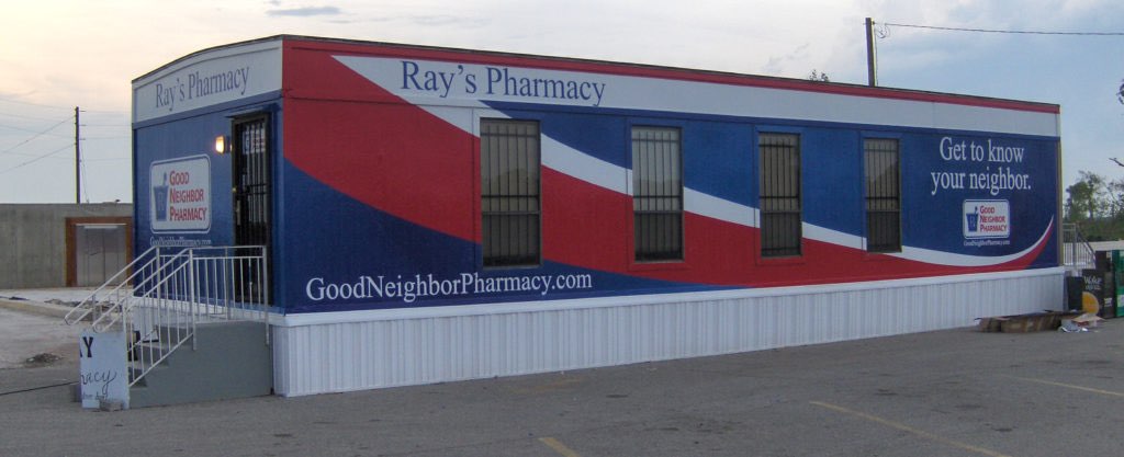
So, you’ve chosen to advertise using vehicle wraps? Good Choice! Now that you have a great way to advertise, you’d like to stand out and be seen the best way you can, right? Here at Ads On Wheels, Inc, we offer free unlimited professional design work to get you on your way to a better business!
Here are some things to think about when trying to stand out:
Part 1: Learn to speak the language of Color:

Color in food advertisements is a big thing in today’s culinary society. The senses and the brain work together to produce illusions that some things of the same color have the same taste. For example, food items that are lemon yellow might taste sour to some people. It is an illusion but it is also a stored memory that the mind releases. The same thing happens with smell. When something black smells burnt or something gray smells smoky it’s your brain releasing those same memories. Both of these are like triggers to your memory.
Another thing that color can do to your food is make you want to not eat so much of it. Blue M&Ms were left out of the bag for years because customers wouldn’t buy more of them and their product sales went down. “Weight loss plans suggest putting your food on a blue plate” says Jill Morton of Color COM, “Or even better than that, put a blue light in your refrigerator and watch your munchies disappear.” It’s fascinating what can change just by changing a color. Some people even dye their food blue to not eat as much. They will dye the rice in there sushi or their spaghetti noodles blue just for that affect.
Color can also affect your mood. Men and women have different color patterns in there brain that make them feel different things. Men feel weaker when around pink. That is why they paint some jail cells a shade of pink for the more violent inmates. Dr. Alexander Schauss, PhD says that “even if a person tries to be angry or aggressive in the presence of pink, he can’t. The heart muscles can’t race fast enough.” The University of Hawaii tested a similar theory. They thought that if they painted the locker room of the opposing team pink so that they would weaken them in time for the game. Their theory was proven somewhat correct and now the WAC has a rule that both locker rooms have to be painted the same color no matter what.
Lastly (the reason you are reading our blog!) can color in advertising really make someone want to buy a product? If the advertisers use the right colors they can! For example, McDonalds’ main colors are red and yellow. Both of these colors are triggers to make you hungry. This is a great marketing tactic for McDonalds and other similar businesses. The colors appear on all of their advertisement, cups and are even the colors of their play area for children. A study was done asking why some product label catches customer’s eyes more than others. It was said that it is actually the metal rim around the product. It is the metallic color is what does it. A survey that color matters sited by Judith Schoolman said that “when all things are identical, shoppers chose products with metal-like labels by as much as 26.7 percent over similar products with plain-paper labels.” Advertising does have a big impact on what consumers buy.
With that in mind here is some advice: Know your audience! If you are a clothing designer that wants to attract 12-18 year old girls, use bright, high contrasting colors! If you are a Doctor or Hospice center, use a lot of white for a pure, clean look. Yellow is a happy, energetic color. Use yellow for important things such as sales and new items.
It’s essential to use colors to project an image of your product. All of these factors are portrayed by the color schemes of advertisement, which connects the colors to the simple, hardcore human factor.


